The Ease App
3 people, 8 days.
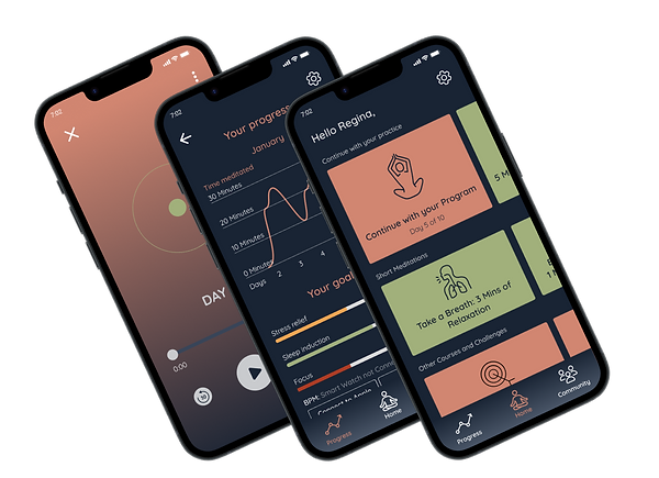
A meditation app tailored to your needs.
I. Project overview
🎯 Goals
🗓️ Process
Over 8 days we conducted over 20 rounds of interviews, including 15 rounds of user testing.
Additionally, we conducted a survey with 88 participants.
❤️ Client (fictional)
👨💻 Role
UX and UI Design, with a particular emphasis on UX writing and copy.
🔐 Problem Statement
🔬 Research Methods
Self-reflective millennials need to find a way to a clearly guided meditation tailored to their needs with an explanation about the direct impact because they need to be motivated to continuously work on their mental health.
Interviews, Questionnaire, Affinity Diagram, Empathy Map, User Persona, User Journey Map, Business Analysis, Visual Competitive Analysis, Moodboard Testing, Moscow Method & MVPs, Concept Testing, Usability Testing, Desirability Testing
Our solution
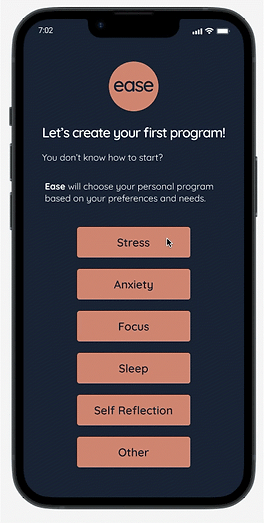
A program for every user
People meditate for different reasons. Given that there are many techniques, some users get overwhelmed and don't know where to start. Ease makes the beginning easy by automatically choosing the fitting program.
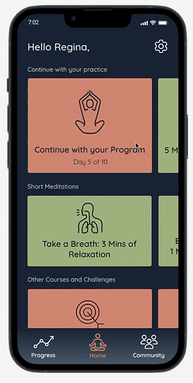
The perfect sessions for any situation
Sometimes we just need to breathe through quickly. Sometimes we want to prepare for a specific event.
And sometimes we are sceptics and need a bit more info and research about meditation.Ease solves all of those issues.
Incentives to keep going
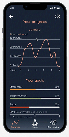
Many users struggle to meditate regularly. Through the use of objective data (e.g. the heartbeat measured by a smartwatch) Ease shows you your individual progress.
Additionally, it allows you to gift free trials to friends... but only if you meditate regularly;)
II. Research
During the entire project we used the "Design Thinking" method: Empathise, Define, Ideate, Prototype, Test.
In this project we used both quantitative and qualitative methods to gather user insights - a survey and interviews.
Summary of the survey
In this abbreviation I will be focusing on the desired length of meditation, the reason why the users started to meditate in the first place, and the most important features of a meditation app for our users.
A more detailed description of the findings, along with an interpretation can be read in my detailed case study on Medium.
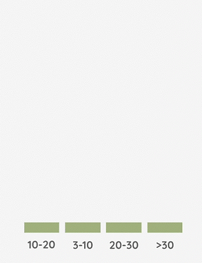
Preferred duration of meditation
According to the answers, the majority of our users (40,9%) prefer to meditate for 10-20 minutes.
68,2% are in the range of 3-20 minutes.
Only 8% wanted to meditate for periods longer than 30 minutes.
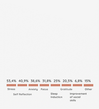
Reasons for meditation
The main reasons for meditation were:
-
Stress (53,4%)
-
Self-reflection (40,9%)
-
Anxiety (38,6%)
-
Focus (31,8%
-
Sleep (25%
-
Gratitude (20,5%)

Favourite app features
The features our respondents liked most were:
-
Tailored meditation
-
Features that help with routine
-
Variation
-
Gamification
-
Measuring the progress
-
Social Features
Another finding of the survey that I want to single out is the irregularity of the practice of our users.
A relatively large group of our users (11,4%) stated that in the last month, they haven't meditated at all, while 18,2% meditated daily.
28,4% meditated on a weekly basis.
You can see a detailed screenshot of the survey results below.

Qualitative Research: The Interviews
In the early interviews, we tried to find out in a little more detail what brought our users to meditation, why they are meditating, and what their meditation- preferences and habits are.
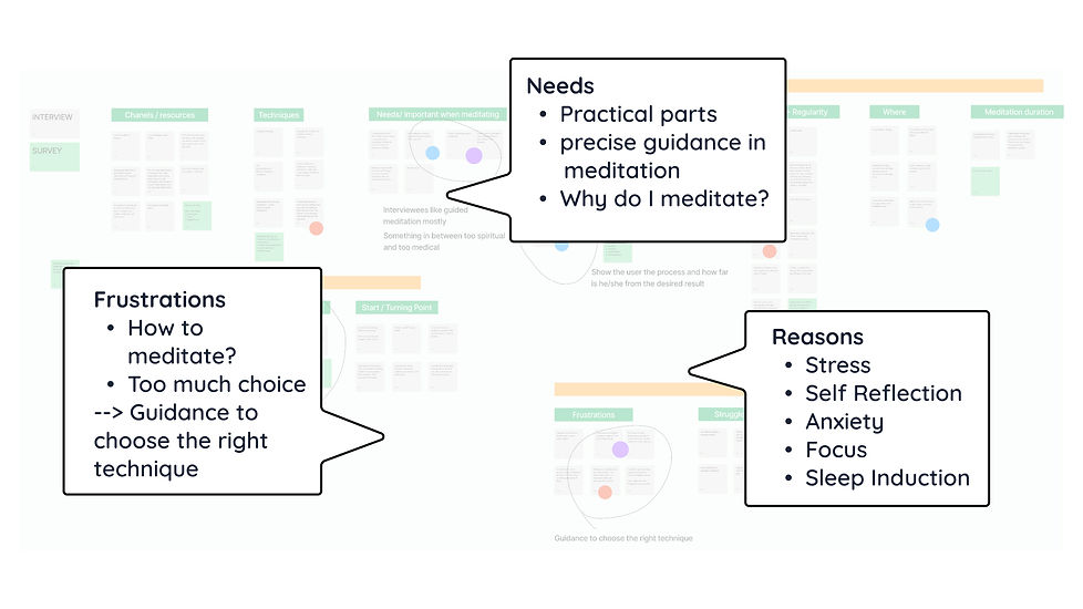
We summarised the insights from both the survey and the interviews using the affinity diagram and the empathy map.
Affinity diagram
Empathy map
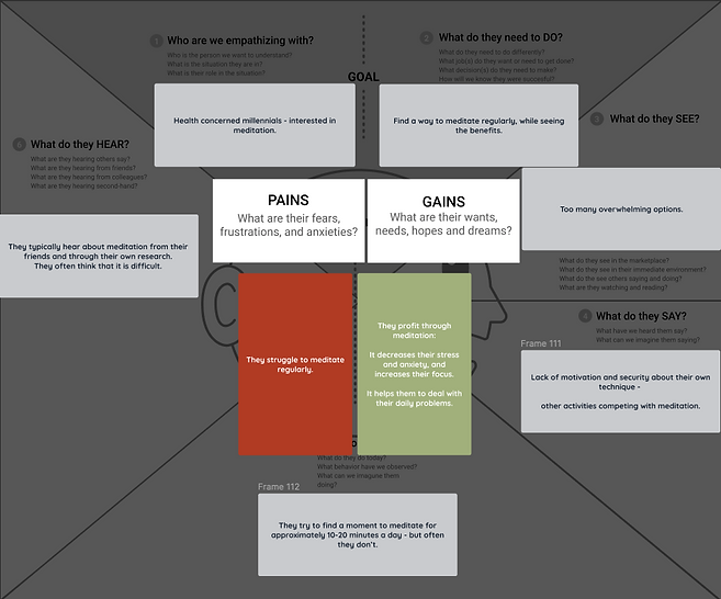
Click on the picture to zoom in
Preferences and positives
-
🤔 "I need to know why I meditate."
-
😍 Features that help build up a routine
-
💭 "I use meditation to deal with my thoughts, concentration, and organisation problems."
-
😫 Meditation helps with anxiety and stress
-
📏 "Measuring my progress is important to me."
Frustrations
-
👎 Struggling with meditating regularly despite seeing the benefits
-
🤷♂️ Many meditation techniques - which is the right one?
-
😵💫 Not knowing if you're doing it right
-
😓 Wanting to meditate more often
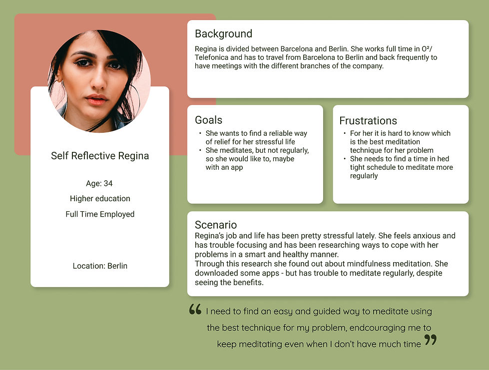
Based on those user insights we created a user persona and a user journey map to empathise with our users and to find opportunities to create exciting features.
User persona
User journey map
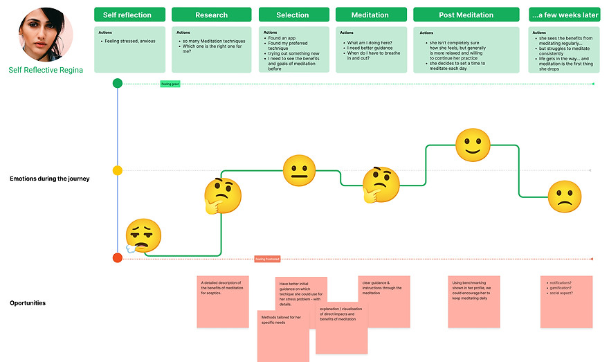
We found opportunities in different parts of the user journey:
-
👩🏫 After downloading the app: A clear explanation of the benefits of meditation (for sceptics).
-
👔 The first try of the app: Instead of blindly choosing a program, the user could get a tailored program, including guidance for the right technique
-
📄 During the meditation: A clear guidance on what to do during the meditation
-
📈 Directly after a meditation: Objective data to show the impact of the meditation
-
❗️ A few weeks later: Incentives to keep going with the routine.
From the user journey and the user persona we developed the problem statement:
Problem Statement
Self reflective millennials need to find a way to a clearly guided meditation tailored to their needs with explanation about the direct impact, because they need to be motivated to continuously work on their mental health.
III. Ideation
In the next stage we started with the ideation phase, using the method "Crazy 8s". Each of us took 8 minutes to sketch out at least 5 ideas for the functionality of the app. You can see the results below.
First Sketches: Crazy 8s
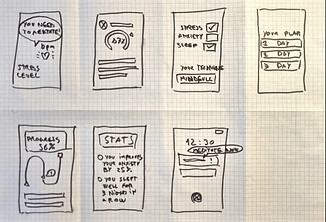
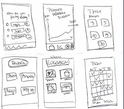
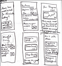
We discussed our ideas and prioritised them using the moscow method. From there we arrived at the MVP - the minimum viable product.
MVP
Our goal is to create an app that helps users to find the best meditation technique tailored to their specific needs by showing its direct impact and benefits. It gives the possibility to track their progress and motivates users to meditate regularly.
IV. Prototyping and Testing
At this stage, we made a mistake. Instead of creating a combined prototype, we decided to use the wireframes we created during the ideation stage and to test the concept individually, after which we started with the mid-fidelity wireframes. While our ideas were practically the same, the mistake cost us valuable time, as we decided to perform the concept tests on the mid-fidelity wireframes as well.
Mid-fidelity wireframes

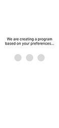
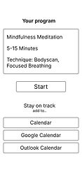
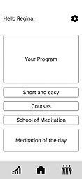
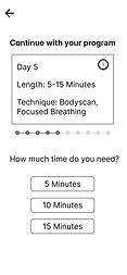
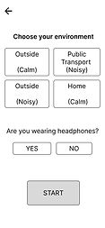
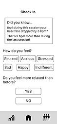

User Testing (Concept- and Usability)
-
#️⃣ 5 users
-
👩💼👨🦱 all genders
-
🧘 experience in meditation
Positives
-
😍 Individual programs adjusted to users' needs
-
🙌 Choosing the environment before meditation
-
📏 Measuring progress with objective metrics
-
⌚️ Connecting smartwatch and fitness band
-
🗓️ Adding sessions to the calendar
-
😍 Tracking moods after the meditation
Negatives
-
👎 No headlines in the home screen, which makes the interface confusing
-
😐 Answering the question about the environment is tedious if you meditate in the same place every day
-
👎 Clicking should be reduced, e.g. through more options in the home screen
Iterations
Homescreen
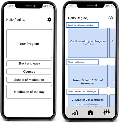
🔧 Added headlines to the home screen to make it easier to scan
🙌 Added galleries into the home screen to reduce clicking and make the interface more compact
Choose your environment
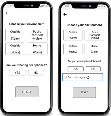
🔧 Added the option to eliminate the question about the environment
❗️The question can be turned on again in the app settings
UI work
After finishing the UX stage and testing our design for usability, we stepped into visual design.
We performed a visual competitive analysis, after which we created a moodboard. We tested the moodboard on 7 people.
Visual competitive analysis


Moodboard
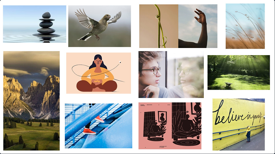
Desired attributes: Calm 🔵 Balanced 🔵 Motivating 🔵 Free 🔵 Conscious
Subsequently, we tested the moodboard with 7 users, letting them describe the words they associate with the pictures. The results of the test were as follows:
-
Peace, calm, liberty, tranquillity
-
Deep, strong, alive, mindful
-
Flexible, balance, energetic, nature, outdoorsy
-
Self-reflection, calmness, freedom, motivation, resilience
-
Nature, clean, calming, free
-
Relaxing, meditation, nature, believing
-
Peace, meditation, soft, motivation, nature
Style tile
After the moodboard testing, we created the style tile for the finished app.

High-fidelity prototype
You can see and test our prototype here. After finishing the prototype we tested it for desirability with 5 users. If the prototype doesn't work, you can also find it here.
Desirability testing
The last step in the design process was the desirability test. We tested the wireframes on 5 people and got the following impressions:
-
"It's relaxing."
-
"I enjoy the colour scheme."
-
"Very neutral."
-
"Calm."
-
"Very human and down to earth"
-
"I would like to see a light mode"
Learnings
The project was intense and fulfilling - and not without mistakes. Because of the rushed process in the low-fidelity stage, we had to repeat the testing on the mid-fidelity prototype and lost valuable time.
Nevertheless, I am extremely grateful for that experience. We learned not to rush and to trust the process. Additionally, for the first time, we were allowed to use quantitative data through our own survey.
If we proceeded with the project, we would take the following steps:
-
More testing
-
Designing more functions
-
Designing different modes, using variables